The Earnings Season

Every couple of months a really exciting time comes around for traders and investors alike, a time to see if these companies, that have consumed hours of people lives in the form of research and reading, report how well or poorly they  did last quarter.  The earnings seasons fill the markets with volatility and just pure craziness, however there is some major money to be made here, so its worth taking a couple of minutes to see just what is going on and how can we benefit from it.

Leading Indicators: Companies report individually at various times throughout the year because of differing fiscal year dates. This means that a sector does NOT report all at once.  Sometimes you can look at company A, who reported earnings today, and forecast how a similar company will do.  For example, today Juniper (JNPR) reported earnings that were less than satisfactory, causing a 21% dive in their price.  Cisco (CSCO) who doesn’t even report their earnings until August had a 4% dip for not other reason than it being a rival company to Juniper.  It makes sense, if company A had weak sales, chances are a company will have similar results. (Excluding outliers like Apple who consistently has super human mega growth.)

Analyst Estimates:  Professionals are tracking companies constantly throughout the whole year.  Some analysts commit all their time to following a single sector, just so that they can better forecast what will happen in the future.  Although they are very smart and make great estimates, they are usually wrong.  Partially because they are making estimates on public information that the company releases, but some of the biggest stock price moving information is held private until earnings are released.  When the analysts are wrong, is when it is time to make some money.  If the economy is doing bad, and the analysts predict that company A’s EPS (Earnings per share) will decrease from 7 to 6, and they report EPS of 6.5 then you have a POSITIVE surprise.  Even though it is worse than last year, it is higher than the analysts forecasted, usually causing an upward movement in price.  This is because the somewhat efficient markets will adjust the prices of stocks to the analysts estimates, until actual numbers are released.

The Whisper Number: Whereas analyst’s estimates are a helpful guide, you can go one step further to the whisper number.  The whisper number gives us a point at which the surprise will be efficient enough to significantly move the stock price. WhisperNumber.com defines it as “the collective expectation of individual investors for quarterly earnings”.  So if the analysts are saying that company A’s EPS will be 5.6 and the whisper number is 6.1, then chances are that the stock price will not have much of an effect if EPS is between the 5.6 and 6.1 range, even though it beat estimates.

EPS vs Sales: The graph below is of Cisco’s price over the last year (graph generated on Bloomberg).  The blue squares with an “E” in them represents when earnings were released.  If the “E” is green it means that the actual earnings were better than analysts were predicting, if it is red then it means the actual was less then.  We see that in the last year ALL FOUR quarterly earnings were better than expected, but the stock took a huge dive every time.  Why would that happen? It is all about the relationship between the EPS and Sales.

Earnings per share takes into account all of your expenses that are apart of your business (bottom line).  Sales is just a sharp measure of how much money came in before any expenses (top line).  In all four of these circumstances Cisco’s EPS surprise was significantly greater than their sales surprise.  At first it looks good, all positive numbers, but as we analyse it we see that there are a couple of red flags.  The only way for earnings to grow is if you grow you top line, your sales, OR you cut your expenses.  The last four quarters Cisco has had very puny growth in sales but has managed to make their margins bigger and bigger.  This may look good on paper, but in reality investors know that the company is not growing, and if so many consistent cuts are being made, it may begin to shrink in the near future.
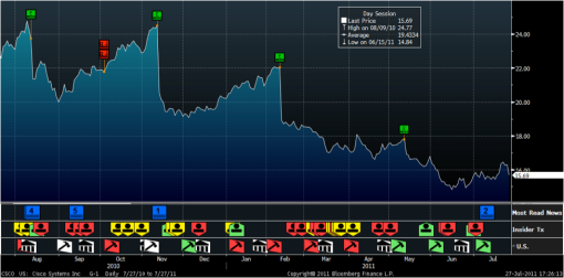
We learn from Cisco that it is not always about simply beating the estimates, but the smart investor will look at the numbers and see what they could mean.  Cisco’s stock price has dropped dramatically every time they have reported earnings in the last year, is this a trend? They report again on August 10th 2011, with Juniper having a horrible earings report, Cisco is not in a great position.  If they have a huge positive surprise it will be a great time to buy because the market is already adjusting for bad earnings.  But when we look at the historical data above, unless sales have really bumped up, it may be a great shorting opportunity.

~Wall Street Surfer~

Finding the Right Stock: The Modified Top-Down Approach

~This post is in response to Joe Fisher’s question on how to pick the right stock~

There are countless companies out there with graphs, ratios, news, reports… yadi yadi yada, how do you we sift through the overload of data to find the information that we want to put our money in? Well there are many different theories; some just trade on technical analysis, others just look for stocks that have a lot of growth potential or are undervalued, there are change wave investors, fundamentalists, big picture investors… the list is endless.  In my opinion a mixture of all of these styles is important, however the most important weighting should be on the macroeconomic data.  This is where you start in the “Top-Down Approach”, first world economic data, then domestic news, then sector analysis, and finally you get to your company.

It is argued by many professionals that macro economic news determines 80%-90% of your returns.  So for example, today European debt crisis did not bring any market shattering news to the table, macro economic outlook: CHECK, the housing starts numbers came out (number of new houses being built).  The number was higher than anticipated, causing people to be more optimistic in the US economy, because housing is a great leading indicator to where the market will go. Local economic news -> good: CHECK!

Next step: sector analysis. We can look at the past couple days, weeks and even months to see who the biggest gainers and losers were in terms of sectors. Today the biggest gains were in Computers and Home Construction, and the biggest losers were in Metals and Mining.  So we see the good economic news and recognize it is a bull market, we find the sectors that are responding the best to this news, the hard part is now over because within both of these sectors, even majority of the bad stocks will have a good day.  As long as you are going with the trend, and are in the right sector, the chances are pretty good that you will come out on top.

This is where you can bring in your fundamental and technical skills to analyze stocks in the hot sectors caught in this upward trend, and find the right stock for you.  However, you could just stop at the sector and either buy/short the ETF that follows the sector.  The return potential may not be as high as if you found a hot stock in that sector, but it saves a lot of time that would have been put into research on individual stocks.

REMEMBER  **Common top down trading rules are to not go against the trend, buy strong stocks in strong sectors, and short weak stocks in weak sectors. **

This approach makes the most sense to me, but everyone has their preference and opinion, I suggest trying out a bit of everything and using it all together rather than picking one way over the other.  But the numbers dont lie, with such a huge weighting on the macro BIG PICTURE outlook, investing starts to look a lot like gambling when you ignore it.

Here are some TIPS for finding the data that you need:

TIP #1: A macro economic calendar can be found here –> http://www.forexfactory.com/calendar.php?s=33f2b4aad81dff731c28aefedb8305bc

TIP #2: You can find a great sector screener here –> http://www.smartmoney.com/htmlsectortracker/

TIP # 3: Found the sector you want to trade/invest in? Find the ETF you need here –>  http://www.bloomberg.com/markets/etfs/

Hope this helps 🙂

~Wall Street Surfer~

(Part 2) The Tech Bubble Indicator: Linked In

Graphic by Maye Wimmer Designs


– This is a continuation of last weeks response to a question received on the Tech Bubble.-

In the last Tech Bubble article we focused on the technical side of the topic, graphs of prices.  Today we are going to use fundamental analysis to understand more about what the Tech Bubble situation is.  Fundamental analysis does not focus on the price movement, momentum, volume or averages but looks at what the company’s efficiency, solvency, profitability… etc. The first fundamental point I want to highlight is the P/E ratio.  This is the price of the stock divided by the earnings per share, or the net income divided by the total amount of shares issued by the company.  This is important because it can tell us if the stock is expensive or cheap, compared to other companies in the industry.  So lets say a stock had a P/E ratio of 10, then we would say that they are trading at 10 times their earnings, or investors are paying 10 times more money than the company is producing.  Why would someone do this? In most cases it is because you are hoping for the company to grow in the future, therefor producing much more revenue.

Today we are going to use Linked In as our specimen, because they were one of the first new internet IPOs (initial public offering).  I will be reference the chart below (Generated on Bloomberg).

  • The first column we have the names of the companies that we will be comparing Linked In to.  However, because Linked In is like the first of its breed to go public, there are not going to be really similar companies to compare it to, but these will have to do.
  • In the next column we see the last price of the company’s stock at close of the market today.  Price alone will not tell us very much, because these companies are of such difference sizes and volume.
  • The 3rd column labeled “EBITDA” represents the earnings of the company, after expenses are taken out.  We see that Linked In makes 9.4 million dollars, like price, this doesn’t tell us very much on its own.
  • The 4th Column shows how much the company earned and divided it by the number of shares outstanding, or “earnings per share”.  Ok so here is our first red flag with this company.  They currently have over 9 million shares outstanding, this means that when they recently went public, they issued over 9 million shares while well aware that they are not even making that much in revenue yet.  Maybe they wanted to get all the money they could from going public so that they have more money to grow? or maybe they are in WAY over their heads and wont be able to live up to the investors expectations… too soon to tell.
  • The final column is the BIG ONE, this is the price of the stock divided by the earnings of the stock. If we take a look at internet giants like Google or Amazon, we see that people are willing to pay 21 times earnings for Google and 90 times earnings for Amazon.  This is all relative to how much the investors think the company will grow their sales and margins in the future.  One reason why Amazon could be so high is the integration of cloud computing, with the new amazon instant as well as the vast amount of books now available on kindle.  The company follows a hot trend, so people pay more for it.  Now lets look at our Tech Bubble indicator, good old Linked In, weighing in at a WhOPPING 1,470 times earnings.  WHOA!! now this, this is a RED FLAG.  Ok so this means that the company is currently earning about $9.4 million, but people are paying as a whole, 13.9 billion dollars.  This fits the mold of the 1999 – 2001 Tech Bubble.  Company after company came out and was valued at a way higher price then they were actually worth.
As we take our fundamental analysis that we did today, and group it with our simple technical analysis of the price volatility when the stock first went public (in the first Tech Bubble article), we can conclude that this is going to be a very important stock to watch. On top of that, analysts have Linked In’s target price at $75, over 25% lower than it is right now.
If Linked In cannot grow their earnings as fast as investors are hoping, as well as keep up with competitors,  then we could see a big drop.  I think that upcoming stalks like Facebook, Twitter… etc will follow a similar path as Linked In, so it will be very interesting to see how the next 12 months plays out for them.
 To sum everything up for Quenton, the person who first ask the question on the subject: The reason why investors are pouring money into these companies that have little or no proven revenue model is the hope for extremely large growth in the future.  People look in the past and say, “man if I only invested in apple when they were still small” or IBM, or Amazon, or Google.  The problem is that these are a handful of internet companies that made it in the long run, out of thousands that bit the dust pretty early on in the game.   I don’t know for sure if we are going into another tech bubble, but if upcoming IPOs follow the path of Linked In, then yes, I think there will be a large spike in the internet sector, followed by a sharp downturn.  Lets just hope that it is not as tragic as the first bubble.
~Wall Street Surfer~

Trading Tip! – TICK and TRIN like Yin and Yang

**Warning: This tip is NOT for long term investors, BUT IS ESSENTIAL to day traders(buy and sell within the day) and swing traders (buy and sell within a few days).

Ok, so these two little symbols, TICK and TRIN mean a world of difference in giving you the upper hand on the trading field.  This tip goes really well with index ETF trading, usually you pick your bull and bear ETFs and get them all warmed up and ready to trade.  Many novice day traders (like myself) have the NASDAQ, S&P 500, and DOW indexes up on their monitor to use as indicators on when to buy and when to sell.  All this does is tell us what the current prices are, and doesn’t give us any an indication of where they may be going.  But that is where our two good friends TICK and TRIN come in! 🙂

The TICK tracks how many stocks are going up versus how many are going down on the New York Stock Exchange.  A positive number is a sign of a bull market, or that the market will go up, a negative number is the sign of a bear market, or that the market will go down.  This is a very short-term indicator, it is essential that you view it on real-time because if there is a big switch, lets say from 400 to -650, then moments later there could be a downturn.  It sounds too good to be true, right? well that is because it is, because it only tells you have many stocks are ticking up or down, and doesn’t take into account VOLUME.  But just like Yin is nothing without Yang, TICK is nothing without TRIN.

The TRIN tracks the market in a similar way but is calculated with volume.  The equation looks like this:

TRIN = (Up Ticks/Up Tick’s Volume) / (Down Ticks/Down Tick’s Volume)

So if the TICK is negative, maybe at -300, one might think “SHORT SHORT SHORT”, but wait a sec, what if the bulk of the volume is being traded in positive direction? Then we have a problem, we have just committed money to an investment off of one indicator, that may or may not be right, this sounds a little like gambling to me.  SO we must always look at both, the TICK and TRIN, if and ONLY IF they are both showing strong signs of positive or negative movement, then we trade on the data, otherwise the worst thing you lose is an opportunity, not your money.

This chart from http://daily-stocks.netfirms.com/trinandtick.htm gives some great guidance on what the values of TICK and TRIN mean:

I encourage everyone to first pull up these two indicators ($TICK and $TRIN) and watch them as you watch the market.  Wait until you feel comfortable with how they affect and predict where things are going before you use real money, and soon enough you will be loving TICK and TRIN as much as I do!

I understand there are many terms that I did not define in this post, please leave any questions you may have in the comment box below, THANKS! 😀

The Tech Bubble (Part 1)

Graphic by Maye Wimmer Designs

This post is in response to a question submitted by Quenton Jones. (Submission available under the “Questions/Requests” Tab)

Today we are going to define the word “bubble”, in the financial sense and address Quenton’s questions tomorrow.

Like a liquid bubble that a child makes with a swipe of a wand, the tech bubble seems to come out of no where, and then leaves even faster, also known as POPPING. Between 1999 and 2001 the markets saw a HUGE bubble formed by internet companies.  The internet got to the point where it was relatively easy to make a site that offered some type of service and start charging people for it.  Investors were blinded by its new, hip, sleek, futuristic feel that high valuations were being put on companies with very murky and unclear revenue models.  How do you put a price on it? number of visitors? clicks? members? How do you forecast growth when you have about 1 year of historical data? well the answer that we found out was that … it was just straight up hard!  Many people rode the wave of excitement and became millionaires in the extremely short periods of time, others lost it all.  As more and more people put their money into these “dot com”-ers, the bubble began to form.

Below is a graph of the NASDAQ Index, which represents just under 3,000 companies in the technology sector.(Generated on Bloomberg)

That HUGE spike in the middle, that is the famous “Dot Com Bubble”.

Recently there have been a new breed of internet sites going public, Linked In and Pandora being two of the most popular, with Facebook, Twitter and others on the way.  This is another thing where people get blinded by the new, flashy, futuristic feel of the companies, but no one really understands their revenue model and/or HOW it will grow.  A perfect illustration is Linked In, the underwriters valued the company at about $45.  However, as we see in the graph below (Generated on Bloomberg), within hours the stock doubled.

That tells us either two things, 1) the best financial professionals in the world have no idea what these companies are worth OR 2) people DONT CARE what they worth, but are blindly investing their money on the dream that the company will have heavy growth in the future. I don’t know the answer to that, but I think we will see in the coming years.  So the question at hand is, “Are we approaching another bubble? And if so, how do I benefit from it?”  THAT is what we will talk about in the next couple of posts.  Hopefully as we analyze these mysterious tech stocks, we will be able to spot some opportunities to make money, and recognize when to run before we get tech-bubble-popped on.

Abram

~Wall Street Surfer~

Quantitative Easing – The quick fix that falls apart in no time!


Today Ben Bernanke stunned the people and the markets with an increase in the probability of more stimulus.  Stimulus or quantitative easing is when the government buys securities in the market, putting more money into the economy to be used.  It is to STIMULATE growth, and EASE the burdens like unemployment, low sales… etc.  In theory it sounds great, we should pump as much money into the market as possible right? get those jobs up! get this economy back on track! … well Im sorry to say that this would be QE 3 or the 3rd time they have done a stimulus package.  If it didn’t work the first time, nor did it work the second… why the third?  Well there are many economists that argue that QE 1 & 2 DID work, that we would be allot worse off without them.  I am going to try and use a surfing analogy to share my view on this.

The traditional surfboard is a piece of foam covered in fiber glass.  It is made light so that you can have maximum control.  The result, however, is that the board is weak and fragile.  The board in this example is the economy.  We wax it up with reasonable taxes, we store it in its bag of low cyclical unemployment, life is good.  BUT THEN, we get a ding, a crack in the fiber glass.  If we do not fix the problem, then the foam will get water logged and the board will start to be eaten away from the inside.  A surfer who cares about his board and wants to preserve it for the long run will get out of the water, and go through the long process of ripping of a chunk of fiber glass, and putting more on.  There is another way to go, it is a QUICK FIX, some people just put some wax in the ding, and hope no water gets in, others use some resin that dries from the sun in minutes, none of which actually protecting the precious foam on the inside of the board. The quick fix is popular because there is no lag time, you crack your board, you put some on, you get back in the water, no sacrifice, zero tough decisions.  But if the ding goes untreated with only the quick fix, water gets in and you dont even know it, sooner than later you realize your board is heavy, discolored and may beyond the point of fixing.

If the US economy is the surfboard, it got a HUGE ding in 2008 and has been taking on water ever since.  There were many attempts to fix it, one of the main being quantitative easing.  People like this because as soon as it is even announced, the stock market surges, and people think that the worst is over… when it has fixed nothing.  As the money is being paid out, few permanent public jobs have been created. When unemployment is going up, and the money pumping into the economy is causing inflation, we get stagflation.  Despite the increase in the stock market and some economic statistics… the economy is rotting on the inside due to these short term, easy, quick fix methods.  And one issue could prove that our US surf board is unfixable, the debt ceiling.

So have things been better the last couple years with the stimulus as compared to without , ya maybe, but are things now looking way worse for us in the future… YES! Our focus is in the now, with blinders that shield the long term perspective, eventually that beat up, waterlogged board gets too weak and it just snaps, I sure hope we quit the quick fixes before that.

Italy’s Debt = 5x scarier than Greece’s Debt!

Today the U.S. markets took a HUGE plunge. Which to some may seem weird because there was little negative American news that came out. Last friday we recieved really bad news on the job situation, but the market didnt fall nearly as far as today. So what happend? Well there was som REALLY important news in Europe that vital for us to understand. A key term to know today is Sovereign Debt, which is the amount of debt a government has issued . It is equivalent to a loan for a house, people loan governments money, and get paid back with interest. Just like with common loans, they get rated. A lower credit rating requires the government to pay a higher interest rate. Well recently there are more and more European Government Bonds being downgraded. This does not just affect that country, but affects every one that has purchased that governments debt.

Today Italy’s debt was downgraded and new fears of a world wide domino effect in the financial markets arose. Well why was there not this much fear with Greece? Is Italy’s situation worse then Greece’s situation? In the world’s eyes, YES! This is because Italy’s sovereign debt is much higher than Greece’s. Meaning a lot more of Italy’s debt is owned by other countries, so if they get downgraded, bad things happen. Some banks will be required to sell off the securities in mass due to regulations, and in the event of a default there will be a huge cut in holdings for banks all over the world. The ripples from this one event could be catastrophic.

This chart shows some of the holdings in european debt by some of the worlds largest banks. (via FT)

One of the most important things to learn from today is that, news moves the markets, no matter where it comes from. As an investor, it is not enough to know what is happening in your own country, but we need to be aware of news worldwide. Some times this world wide news (like Italy’s Debt situation) will have a greater impact than local news (like last weeks job report).

Lets just hope that the European countries will play nice and continue to help Italy and Greece out of their slump, because, the world depends on it, quite literally.

Friday’s Bad News

Every week we hear statistics on the economy in the form of numbers, percentages and fancy names we have for economic indicators.  But what really is going on?  Why was everyone so upset today?  Well there were a couple big disappointments that came out in the news, I am going to talk about one of them, the UNEMPLOYMENT RATE.  The unemployment rate rose from 9.1% to 9.2% in June.  At first one might think, “well it is only ONE percent, why is is such a big deal?!”  This little tiny 1% played a huge role in the markets dropping a large number of points immediately after they opened today.  Sometimes it is hard to understand how the stats are computed, what is left out and what is counted, so I will say it in a simpler way.  In the last 16 months there has been over 2,000,000 private sector jobs created in the United States, HOWEVER we have lost more than 8,000,000.  We are years past the “Financial Meltdown”, but we are no where near a recovery.  We need to be creating well over 100,000 jobs a month, but only 18,000 jobs were recorded for the month of June… this means big trouble.

So as an investor, am I stuck? The markets went down, if I take my money out I’ll incur a loss, if I put more money in, I could end up losing more, what can I do?  The truth is you not only make money if the markets go up, but when they go down too! Today I woke up at 3:30 am Hawaii time, I read the unemployment report and I knew, this was bad news.  When the markets opened and chaos filled the charts and tables on my computer screen, I waited for it to settle… about 15 minutes after opening bell I put my money in a special fund called an ETF or Exchange Traded Fund.  ETFs are becoming a trader’s best friend, they can do just about anything.  This particular ETF (BXDC) shorts the S & P 500 meaning the value of the fund goes up as the market goes down.  As the market took a dive, I watch my little ETF friend climb and climb until I felt satisfied with the gain and I sold it before it could drop.  In a day with so much chaos, a LITTLE knowledge went a LONG way

So what do these little economic indicators mean for you and your portfolio? your pension? your life savings? … EVERYTHING.  It is argued that 84% of returns are determined by macroeconomic news. If that is true, then it does not seem that important to stress over what stock to put your money into, and at some degree even, what sector to invest in.  Instead, at a time with so much financial and economic uncertainty, people of all different occupations need to learn some basics in investing,  so that they know what is going on with their money, and their future. Because just as spider man learned the direct connection between power and responsibility, with financial KNOWLEDGE comes great PEACE and SAFETY.

Abram, The Wall Street Surfer